The information in this post about how to make art stronger with differences comes from Nicholas Wilton’s Art2Life and Creative Visionary Programs and is published with permission.
Vive la différence!
Nicholas Wilton, founder of Art2Life and the Creative Visionary Program (CVP), often talks about how differences can make your art stronger.
“One of the overarching ideas in this course is differences. How can what we include in our art, not to mention our life, make us feel more alive? Understanding the juxtapositions of opposites in our art will allow us to better exploit and communicate our own particular point of view more powerfully. Putting something next to what it’s different from—even its opposite—makes it more like itself.”
Nicholas Wilton
Why Differences Matter
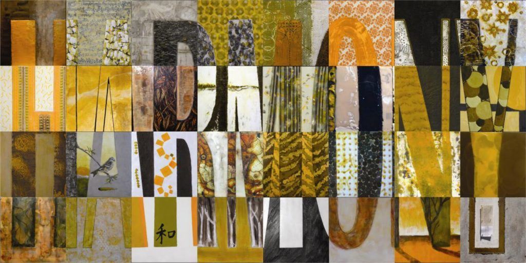
Differences in shapes and forms make art interesting. They engage the viewer and keep the artist inspired. When everything looks the same, it feels boring—both to create and to observe.
The Juxtaposition of Opposites
In art, the most powerful difference is value contrast (light vs. dark). But there are many other contrasts to explore. Here’s a list to inspire you:
- light/dark
- big/small
- loose/controlled
- thin/thick
- opaque/transparent
- squiggly/straight
- single/multiple
- colour/grey
- soft/sharp
- rough/smooth
- density/spaciousness
- repetition/random
- hidden/exposed
- deliberate/accidental
- realistic/abstract
Evaluate Your Work
Last year, I took the Creative Visionary Program. It transformed how I evaluate my paintings. Now, when I look at work I’m proud of, I understand why it works. I see what makes the design strong. I can also look at older paintings stacked in my studio and, using CVP principles, identify ways to improve them.
We all tend to repeat similar marks. When you review your work, check if your marks are too uniform. If they are, switch tools. Use a larger brush or a much smaller one. Add a tiny line next to a big brushstroke. This contrast will bring energy to your piece.
Going too far with Differences
More differences don’t always mean better art. Sometimes, a single exquisite difference can create a profound effect. If your elements are too different, they may lose their connection. The principle of differences works best when elements still relate to one another.
Nicholas Wilton uses a garage sale analogy. At a garage sale, everything is thrown on a table without curation. To fix this in your painting, decide which elements should stand out. Give those elements the biggest value contrasts. Elements you want to downplay should have less contrast.
Organize Values for Balance
When your painting feels too busy, simplify it by adjusting values. Paint half of the high-contrast shapes closer to the background’s value. This reduces visual noise and creates more space in your composition.
Final Thoughts
Do you get how you can make art stronger with differences?
Differences bring life to your art. Use them thoughtfully. Explore contrasts, evaluate your work, and adjust as needed. By embracing differences, you’ll create art that feels dynamic and alive.
In this post, I refer to Nicholas Wilton and his courses. The Art of Your Life Free Workshop with Nicholas Wilton is a free 5-day-long online video series delivered to your inbox. Nick will teach you how to harness the principles of Design, Value, and Color to REALLY ramp up your art… and, have a lot more fun while you’re at it.