In the last part of 2009, my friend and fellow artist, Anne Smidt sent me an enthusiastic email asking if I wanted to be a part of a new project, a collaborative work. Anne had just finished working with me on the 4th annual International Encaustic Artists (IEA) Retreat & Conference in Carmel Valley, CA where I had spent the past 3 years as the director for the annual gathering of artists working with encaustic. Anne had created a database and reporting system for all of the registrations – so I knew that she would bring an amazing set of talent to whatever project she wanted to create.
At the retreat, Anne had connected with artist Rodney Thompson. Rodney is not only an artist working with encaustic, but the owner of a fine art panel making company. Rodney’s exceptional skills for planning and design would be key components in bringing this project together.
In the early stages of this project we were working on the “what”. What do we want to do? We knew the “why”- Anne had felt a powerful connection to all of the other artists at that last retreat in Carmel Valley and was so energized to be talking wax, methods, inspiration, etc. with her fellow artists that she was looking for a way to reach out and stay connected to other artists by way of a group project.
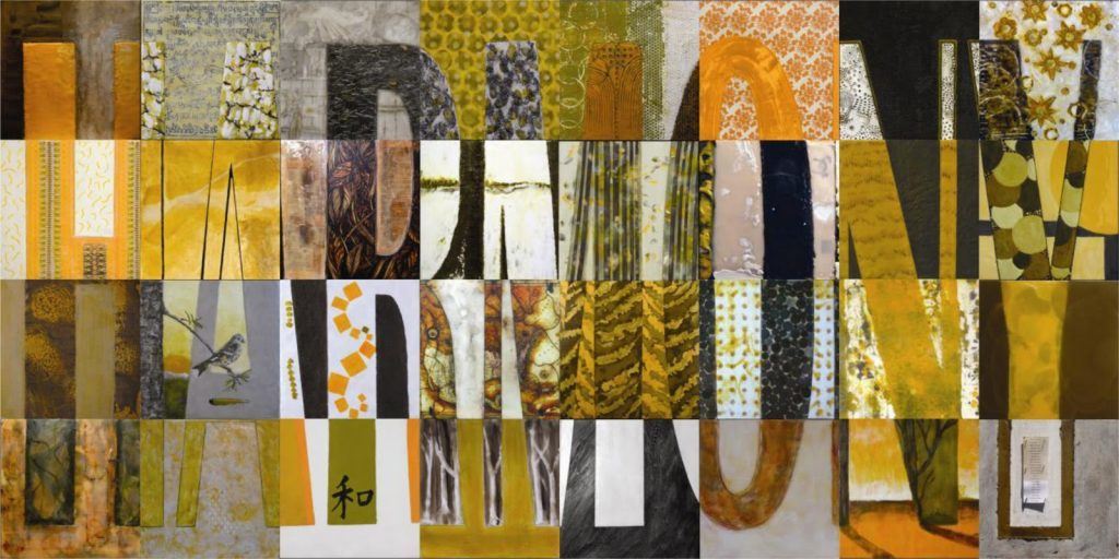
The “what” distilled into a vision for a large scale grid painting that would combine the work of 32 artists. Through telephone conversations and email exchanges the foundation for Harmony was build: create an 8-foot-by-4-foot grid made up of 32 individual 12”x12” panels with the word “harmony” spanning it’s entirety. Each panel would contain a portion of the complete design, and would be painted by 32 individual artists. When completed the panels would be reassembled to form the completed piece, spelling out the word “HARMONY” in 32 different artistic styles.
Once the word Harmony was chosen, Rodney set to work on testing out fonts for us to ponder, as the font had to be “readable” on a large scale; it also had to be able to “break-down” into small sections for each 12×12 panel. Rodney then constructed each panel and made individual templates that each artist would follow to create their portion of the word. His design also included the mechanism for the entire grid to be assembled into one piece for installation.
HARMONY PROJECT
Harmony is a collaborative 4 ft x 8 ft encaustic artwork created by 32 artists. Each of the individual panels is 12 x 12 inches.

Collaborative project – Anne Smidt, Rodney Thompson, Cari Hernandez
Artist listing below:

During this time, I was working on developing the color pallet. I set to work making color swatches, looking at complements, tonal qualities , etc. I felt that there were several considerations:
- keep the pallet limited but allow enough choice so that each artist could express themselves;
- keep the color choices HARMONIOUS, right?-the colors really needed to support the work (be strong yet gentle;)
- choose a pallet that would allow for enough contrast, so important to keep each portion of the letters “readable”;
- choose colors that artists could easily get (and be familiar with);
- choose colors that blend well into each other (combine) – keeping in mind levels of transparency and opacity.
I would email Anne and Rodney color samples, and we would dialog about choices and combinations until the final pallet was chosen.
As the project developed, it became very clear that there was a second “big” piece to this work- to give. We were clear on the intention to connect other artists in a unified project, but the clarity to somehow give back was an organic part of this project that unfolded as Anne, Rodney and I worked together. So the three of us worked out the details of selecting a beneficiary that would hold the values and spirit of the work, and that was Habitat for Humanity.
With this last detail in place, we launched a “call for artists” in June of 2010. It was a thrill to see the excitement for this project grow- we had the 32 artists committed in a short amount of time. Each artist agreed to pay for their panel and all associated costs to complete their work and get it shipped to its eventual owner or destination. This was a big commitment on each artist’s part, donating a substantial amount of time and materials to help bring Harmony to life. Each artist agreed to abide by the guidelines that we had established, and complete the work by the end of October 2010.
Once we had a digital image from each artist, a composite image could be created illustrating what the final grid would like like once it was reassembled. We were eager for all of the artists to complete their panel, for we knew that in order to solicit galleries for a showing we would need an image of the completed work.
As each of the individual images were starting to come in, so were the personal stories – expressing what being a part of this project had meant for them. The stories were so intriguing and inspiring-hearing about what challenged some, what stretched some in new directions, and what inspired and motivated them. This project had grown from merely being a grid of 32 different paintings, to a community coming together to create something larger then themselves.
During this time, the Encaustic Art Institute (EAI) became aware of the project, expressing great interest in purchasing Harmony for their permanent collection. EAI embraced the spirit of the project, and wanted to continue to raise funds for Habitat for Humanity through specially designed exhibitions for Harmony. We worked together to finalize the details of the sale, and in February 2011 Harmony was sold to EAI.
Under the direction of its new owners, Harmony is scheduled to tour eight major cites in an effort to continue raising funds for Habitat for Humanity. Harmony is scheduled for it’s debut in Albuquerque, N.M.
It has been a great pleasure to be a part of the Harmony project, I am grateful for the opportunity. Anne, Rodney and I created a support structure while working together-learning to give, take, and wait, in a harmonious way.

