Do you find that you are in the habit of using the same colours all the time? In this post, Nicholas Wilton presents a fresh approach to colour mixing. Every year, I look forward to Nicholas Wilton’s Annual Art of Your Life Workshop. This class helped me understand colour so much more clearly than I ever had before.
Understanding Colour to make your art stronger
The 5 most important aspects of Colour
from Nicholas Wilton
- Value = the lightness and darkness of a colour. The viewer will see the highest value contrast areas in your art first. Value is noticed by the viewer before colour
- Saturation = the purity or intensity of a colour
- Temperature = the warmth or coolness of a colour
- Harmony = colours that are in harmony must contain at least one common colour
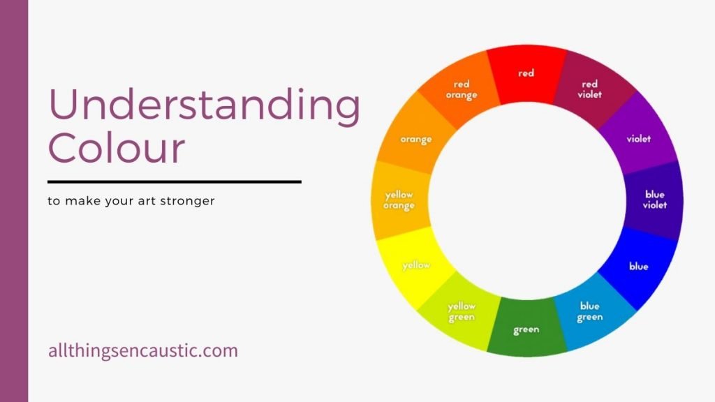
- Complements = are those colours that are directly opposite from one another in the colour wheel
Value: remove the colour

To see the value of your work, you need to see the lightness and darkness of it, not the colour. If you look at your work in a different way, it will be easier to know what you need to do next.
Here’s a tip from Nick:
When you’re don’t know what it is that just isn’t working, snap a photo of your work in progress with your phone. Edit the image and turn it into black and white… slide it to Noir. Now you are looking at the value contrast, not at the colour of the paint.
Stuck in a colour palette rut?
Are all of your paintings looking the same? It is all fine and good to work in a series so your works speak to each other, but are you stuck? Are you using certain colours just because you have them already in pots on your griddle? Are you using a certain colour simply because you had success in the past using that colour palette? Maybe it’s time for something fresh.
The book giveaway he mentions at the end of the video is no longer happening. But you can join the annual Art2Life Workshop that starts Feb 15, 2021
Start Fresh
- If you use pots to melt your wax, start by cleaning off your griddle.
- Pour the coloured medium you have into silicone muffin cups. When the wax fully cools you can pop the wax out and store it away to use in the future.
- Put your favourite colours out of reach.
Mix new colours that are in harmony
If you take a little bit of every colour on your palette and mix them together, you’ll get a neutral, harmonizing colour.
Mixing a small amount of this harmonizing colour back into each colour helps create a beautiful palette where all the colours relate to one another.
Colour harmony can be created by either mixing paint colours together or by glazing thin layers over other paint colours.
Explore Glazing
A simple way to get harmonize the colour in your painting is to glaze. By thinning colours with clear encaustic medium you can work with transparency. Commercial encaustic paints are very highly pigmented, a little bit mixed in with un-pigmented medium can go a long way. Glazing creates an interesting contrast between transparency and more opaque colours. Layering transparent colours on top of other colours can create interesting translucent effects and can also harmonize colours.
- Colour gets very rich when there are thin layers of glazes on top of other colours.
- Glazing harmonizes colours
- Glazing creates Transparency. Now you can add the opposite – Opacity. This creates depth
Encaustic Colour Mixing Tips
- Many artists mix encaustic colours directly on the heated palette instead of in pots. If you’re used to using pots, I recommend that you try it this way at least once
- Use natural golden encaustic medium for mixing colours on the yellow side of the colour wheel. Use filtered white medium for mixing other colours. Encaustic medium made from natural golden beeswax will have that wonderful beeswax smell—white medium will not.
- Mix a little white encaustic paint into golden medium, and you will get a lovely buff white (I call this Andrea White after Andrea Bird who taught me this and so much more). For pure white, use filtered white medium.
- To get a deep rich black, buy a commercial encaustic paint from R&F, Kama Pigments, Enkaustikos or Evans Encaustics. Commercial paints are highly pigmented and you just can’t achieve a rich enough colour mixing your own black with tube oils.
I hope that you found this approach to colour helpful. If so, leave a comment below.
In this post, I refer to Nicholas Wilton and his courses. The Art of Your Life Free Workshop with Nicholas Wilton is a free 5-day-long online video series delivered to your inbox. Nick will teach you how to harness the principles of Design, Value, and Color to REALLY ramp up your art… and, have a lot more fun while you’re at it.


Thank you, Ruth! You and Nick are BOTH generous teachers!
I watch Nick all the time. His info is wonderful. Thank you so much.
Hi Joan, yes Nick is a generous teacher. I’ve learned a lot from his programs.
I think you have just solved a very big problem that I have had all my life…(I am 78).
That’s great Linda! Be sure to join the Art2Life free training. You’ll learn even more.